FIRST LOOK: Tesla’s new Climate Menu revealed
Tesla’s new, redesigned, and streamlined Climate Menu is getting its first looks after the automaker brought a new look to vehicles with a recent Software Update.
Earlier this month, we reported that Tesla was making a number of changes to its Climate Control settings. Along with a new feature that would calm the fan level while on the ‘Auto’ setting during a phone call to decrease ambient noise, Tesla’s release notes stated it would also roll out a new, redesigned Climate Control panel.
Some owners complained about the lack of ease there was when making adjustments to the vehicle’s temperature or airflow, which enticed Tesla to make some changes.
We are now getting our first looks at the new design (h/t Not a Tesla App):
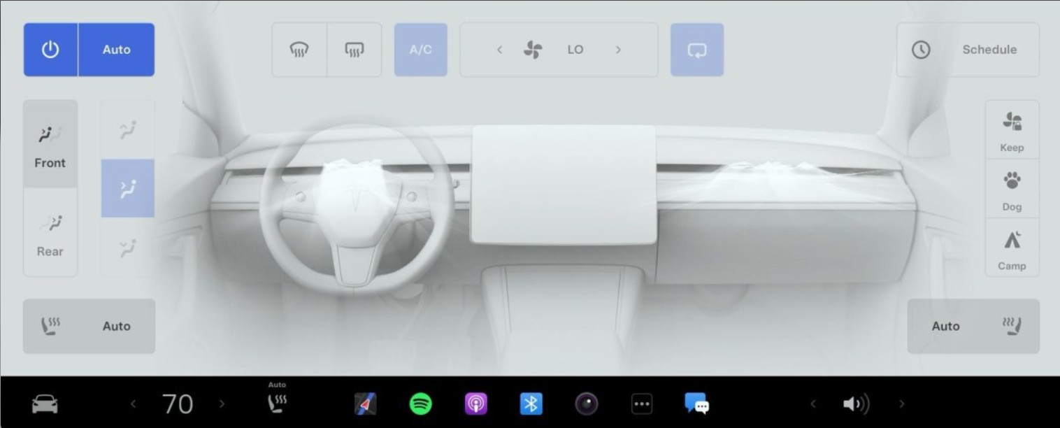
Tesla’s Old Climate Control Panel

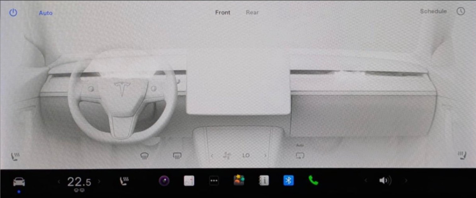
Tesla’s New Climate Control Panel

The new icons are definitely more subdued and could cause less havoc among drivers who want to change the settings of their interior climate.
It is definitely less busy than the previous design, and it is undoubtedly streamlined. It seems this will absolutely be a very welcomed appearance for some drivers, but others may feel the older design is simply easier to navigate due to the large, bold buttons.
Nevertheless, Tesla’s minimalistic design is coming to the forefront here. Just as it has streamlined vehicle interiors, most recently with the new Model 3 “Highland” and even the Cybertruck, Tesla is looking to make things as simple as possible to navigate, which seems to have worked based on the new appearance that is shown here.
I’d love to hear from you! If you have any comments, concerns, or questions, please email me at joey@teslarati.com. You can also reach me on Twitter @KlenderJoey, or if you have news tips, you can email us at tips@teslarati.com.

The post FIRST LOOK: Tesla’s new Climate Menu revealed appeared first on Cars News Magazine.
The Auto Xone
Comments
Post a Comment